
Introduction
When I think about what makes a good website design, I’m reminded of how it’s more than just aesthetics—it’s about creating an experience. A well-designed website balances visual appeal with functionality, ensuring users can navigate effortlessly while feeling engaged. Whether you’re a business owner or a designer, understanding these principles is key to crafting a site that stands out and delivers results.
Key Takeaways
- User Experience (UX) is paramount: A good design prioritises ease of use and intuitive navigation.
- Visual appeal matters: Striking visuals and cohesive branding leave a lasting impression.
- Responsive design is non-negotiable: Your site must perform flawlessly across all devices.
- Speed and performance: Fast loading times keep users engaged and improve SEO rankings.
- Content clarity: Well-organised content with ample white space enhances readability.
Understanding the Basics of Website Design
Defining Good Website Design
Good website design isn’t just about looking pretty—it’s about functionality and purpose. A well-designed site aligns with its goals, whether that’s driving sales, sharing information, or building a community. It’s a blend of aesthetics, usability, and performance. For example, cool website design often balances creativity with practicality, ensuring users stay engaged without feeling overwhelmed.
The Importance of User Experience (UX)
UX is the backbone of effective design. It’s about understanding how users interact with your site and making their journey seamless. From intuitive menus to clear calls-to-action, every element should guide the user naturally. Poor UX can drive visitors away, while a thoughtful approach keeps them coming back. Think of it as the difference between a frustrating maze and a well-lit path.
The Role of Visual Appeal in Design
First impressions matter, and your website’s visual design sets the tone. Colours, typography, and imagery should reflect your brand’s identity while being pleasing to the eye. Consistency is key—every page should feel part of a cohesive whole. For inspiration, check out top design trends, which highlight how modern aesthetics can elevate your site’s appeal.
The Psychology Behind User Engagement
How Users Interact With Websites
When users land on a website, their behaviour is often driven by instinct and habit. We’ve found that they scan content quickly, looking for visual cues like buttons, headings, and images to guide their journey. If the design doesn’t align with their expectations, they’re likely to leave within seconds. That’s why understanding user experience is crucial—it helps us create intuitive layouts that keep visitors engaged.
Another key insight is the F-shaped reading pattern, where users focus on the top and left side of the page. By placing critical elements like navigation menus and calls-to-action in these areas, we can ensure they’re noticed. It’s not just about aesthetics; it’s about anticipating how users will move through the site and designing accordingly.
The Impact of First Impressions
First impressions are formed in milliseconds, and they’re incredibly hard to change. A cluttered or outdated design can instantly erode trust, while a clean, modern layout signals professionalism. We prioritise visual appeal because it’s the first thing users notice, and it sets the tone for their entire experience.
Colour psychology plays a significant role here. Warm tones can evoke excitement, while cooler shades suggest reliability. Typography also matters—readable fonts make content accessible, while unique typefaces can reinforce branding. Every detail contributes to that critical first impression, so we ensure nothing is left to chance.
Designing for User Behavior
Understanding user behaviour allows us to design with purpose. For example, we know that users prefer short, scannable paragraphs over dense blocks of text. By breaking content into digestible chunks and using bullet points, we make it easier for them to find what they need. This approach aligns with best practices for readability and engagement.
Interactive elements like hover effects and micro-animations can also enhance the experience by providing feedback. However, we use these sparingly to avoid overwhelming users. The goal is to create a seamless journey where every interaction feels natural and rewarding, keeping visitors on the page longer.
Essential Elements of Effective Website Design
Navigation and Structure
A well-structured website is like a well-organised book—it guides users effortlessly from one section to another. We focus on creating clear, logical navigation menus that help visitors find what they’re looking for without frustration. Breadcrumbs and search bars are also invaluable tools for improving usability, especially on larger sites.
Hierarchy is another critical factor. By using headings and subheadings strategically, we ensure users can quickly scan and understand the content. This not only enhances the user experience but also supports SEO efforts by making the site more crawlable for search engines.
Color Theory and Application
Colour is more than just decoration—it’s a powerful communication tool. We use it to evoke emotions, highlight important elements, and create visual harmony. For instance, contrasting colours can draw attention to calls-to-action, while a cohesive palette reinforces brand identity.
Accessibility is also a priority. We ensure sufficient contrast between text and background to accommodate users with visual impairments. By adhering to WCAG guidelines, we create designs that are not only beautiful but inclusive.
Typography and Readability
Typography is the backbone of content presentation. We choose fonts that are legible across devices and screen sizes, balancing personality with practicality. Sans-serif fonts like Arial or Helvetica are often ideal for digital content due to their clean lines.
Line spacing and paragraph length also play a role in readability. Too much text crammed together can be daunting, while ample white space makes the content feel approachable. It’s a delicate balance, but one that significantly impacts how users perceive and engage with the site.
Responsive Design and Mobile Optimization
The Necessity of Mobile-Friendly Design
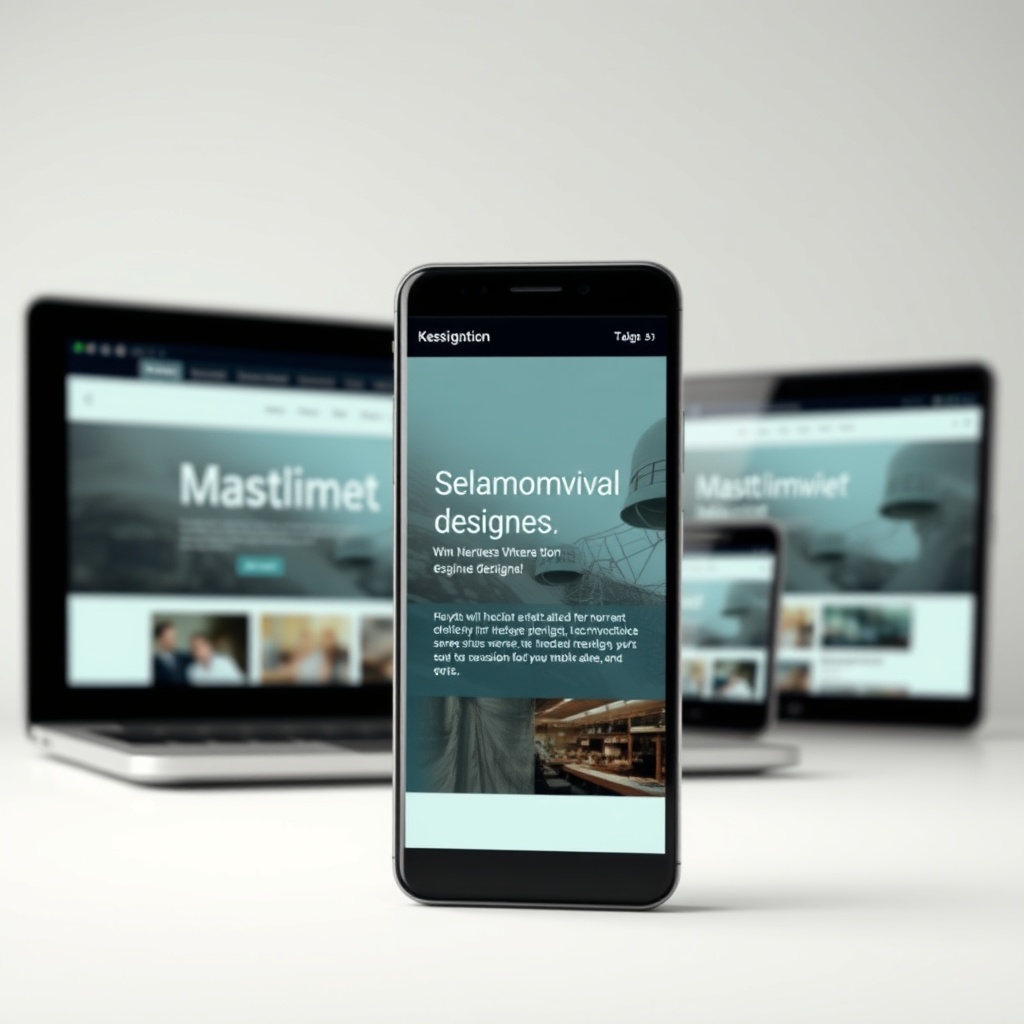
With over half of web traffic coming from mobile devices, a responsive design isn’t optional—it’s essential. We ensure our sites adapt seamlessly to any screen size, providing a consistent experience across devices. This not only improves usability but also boosts SEO rankings, as search engines prioritise mobile-friendly sites.
Users expect fast, intuitive interactions on their phones. Slow load times or awkward navigation can drive them away instantly. By optimising images and simplifying layouts for smaller screens, we create a frictionless experience that keeps visitors engaged.
Techniques for Responsive Layouts
Flexible grids and media queries are the backbone of responsive design. We use these tools to ensure elements resize and reposition dynamically based on the device. For example, a three-column desktop layout might stack into a single column on mobile, maintaining readability without sacrificing functionality.
Touch-friendly design is another consideration. Buttons and links need to be large enough to tap easily, and forms should be streamlined for mobile input. These small adjustments make a big difference in usability, ensuring users can interact with the site effortlessly.
Testing Across Devices
No responsive design is complete without rigorous testing. We check our sites on a range of devices and browsers to identify and fix any issues. Tools like BrowserStack and Chrome DevTools help us simulate different environments, ensuring a flawless experience for every user.
Performance is also part of the equation. We minimise code and leverage caching to speed up load times, especially on slower mobile networks. By prioritising both aesthetics and functionality, we create designs that look great and perform even better.
Speed and Performance Optimization
The Importance of Loading Times
We often underestimate how crucial loading times are for a website’s success. A delay of just a few seconds can lead to higher bounce rates and lost conversions. Users expect instant access to information, and search engines prioritise fast-loading sites in rankings. By optimising images, leveraging browser caching, and minimising HTTP requests, we can significantly improve performance. It’s not just about speed—it’s about retaining visitors and enhancing their experience.
Balancing aesthetics with performance is a challenge we face daily. Heavy graphics and complex scripts may look impressive, but they can slow down your site. Tools like Google PageSpeed Insights help identify bottlenecks. Remember, a sleek design means nothing if users abandon your site before it loads. Prioritising speed ensures your web design delivers both beauty and functionality.
Tools for Speed Optimization
There’s no shortage of tools to help us optimise website speed. From GTmetrix to Pingdom, these platforms provide actionable insights into performance issues. Compressing images with tools like TinyPNG or using lazy loading techniques can make a noticeable difference. We also recommend leveraging content delivery networks (CDNs) to reduce latency. Speed isn’t just a technical metric—it’s a cornerstone of user satisfaction and SEO success.
Another overlooked aspect is server response time. Choosing a reliable hosting provider and optimising database queries can drastically improve load times. Regularly auditing your site with these tools ensures continuous improvement. Speed optimization isn’t a one-time task; it’s an ongoing commitment to delivering the best experience for your audience.
Balancing Aesthetics and Performance
Striking the right balance between visual appeal and performance is an art. We love creating stunning designs, but not at the expense of usability. Lightweight frameworks like Bootstrap or Tailwind CSS allow us to build responsive layouts without sacrificing speed. Animations and interactive elements should be used sparingly and optimised for performance. A user-first approach ensures your site remains both beautiful and functional.
Testing across devices is essential. What looks great on a desktop might lag on mobile. Tools like BrowserStack help simulate different environments. By prioritising performance in our design process, we create sites that not only impress but also perform flawlessly. After all, a fast website is a happy website.
Content Strategy and Layout
Organizing Content for Clarity
Content is the backbone of any website, but without proper organisation, it can overwhelm users. We start by defining a clear hierarchy, using headings and subheadings to guide readers. Bullet points and short paragraphs improve readability, while a logical flow ensures users find what they need quickly. A well-structured layout enhances engagement and keeps visitors on your site longer. Clarity is key to effective content strategy.
Visual cues like icons or call-to-action buttons also play a role. They direct attention and simplify navigation. Consistency in formatting—such as font choices and spacing—creates a cohesive experience. Remember, users scan before they read, so make every element count. A clutter-free layout not only looks professional but also improves usability.
The Role of White Space
White space, or negative space, is often misunderstood. It’s not wasted real estate—it’s a powerful design tool. By giving elements room to breathe, we reduce cognitive load and highlight key content. White space improves readability and creates a sense of elegance. Whether it’s margins, padding, or line spacing, thoughtful use of white space enhances the overall aesthetic.
It also contributes to mobile responsiveness. On smaller screens, crammed content becomes unreadable. White space ensures your design adapts seamlessly. Don’t fear emptiness; embrace it as a way to elevate your message. A minimalist approach often speaks louder than overcrowded layouts.
Engaging Users with Multimedia
Multimedia elements like videos, infographics, and interactive charts can transform static content into dynamic experiences. We use them to break up text and illustrate complex ideas. However, moderation is key. Overloading a page with media can slow it down and distract users. Always optimise files for the web and provide alternatives like captions or transcripts for accessibility.
Embedding a relevant video, for example, can boost engagement without overwhelming the page. Multimedia should complement your content, not compete with it. When used strategically, it enriches the user experience and keeps visitors coming back for more.

Accessibility and Inclusive Design
Understanding Web Accessibility Standards
Web accessibility ensures everyone, including people with disabilities, can use your site. We adhere to standards like WCAG (Web Content Accessibility Guidelines) to create inclusive designs. Simple adjustments, such as alt text for images or keyboard-friendly navigation, make a world of difference. Accessibility isn’t just a legal requirement—it’s a moral obligation. By designing for all, we expand our audience and foster inclusivity.
Screen readers, voice commands, and high-contrast modes are just a few tools users rely on. Testing with these in mind helps us identify gaps. Accessibility should be integrated from the start, not tacked on as an afterthought. A truly inclusive design benefits everyone, regardless of ability.
Designing for All Users
Inclusive design goes beyond compliance—it’s about empathy. We consider diverse needs, from colour blindness to motor impairments. Clear typography, scalable fonts, and intuitive interfaces ensure no one is left out. Our goal is to create experiences that are usable and enjoyable for everyone. SEO best practices often align with accessibility, making it a win-win.
User testing with diverse groups provides invaluable feedback. What works for one person might frustrate another. By listening and iterating, we refine our designs to be universally accessible. Inclusivity isn’t a trend; it’s the future of web design.
Tools for Accessibility Testing
Tools like WAVE or Axe help us evaluate accessibility compliance. They highlight issues like missing alt text or poor contrast ratios. Manual testing with assistive technologies, such as screen readers, ensures real-world usability. Regular audits keep our sites up to standard as guidelines evolve.
Accessibility isn’t a checkbox—it’s a commitment to continuous improvement. By leveraging these tools, we create websites that are not only compliant but genuinely user-friendly. After all, the web should be a place for everyone.
The Power of Branding in Web Design
Creating a Consistent Brand Identity
A strong brand identity is the cornerstone of effective web design. We ensure every element—from logos to colour schemes—reflects your brand’s ethos. Consistency builds trust, and trust fosters loyalty. Whether it’s the tone of your copy or the style of your imagery, every detail should align with your brand’s voice. This cohesion makes your website instantly recognisable and memorable.
Consider how branding marketing integrates seamlessly into your design. A well-crafted identity doesn’t just look good; it communicates your values. We’ve seen how cohesive branding elevates user experience, making visitors feel at home. It’s not just about aesthetics—it’s about creating a connection that resonates long after they’ve left your site.
Using Colour and Imagery to Reinforce Branding
Colour psychology plays a pivotal role in branding. We choose palettes that evoke the right emotions, whether it’s the calm of blues or the energy of reds. Imagery, too, must reflect your brand’s personality. Authentic photos and bespoke graphics tell your story better than stock images ever could. Every visual element should feel intentional, reinforcing your message without overwhelming the user.
For example, graphic design principles guide our choices, ensuring visuals are both striking and purposeful. A well-curated gallery or a thoughtfully designed infographic can speak volumes. It’s about balancing creativity with clarity, so your brand’s essence shines through every pixel.
The Impact of Branding on User Trust
Trust is earned through consistency and professionalism. A polished brand presence signals reliability, encouraging users to engage. We’ve observed how cohesive branding reduces bounce rates and boosts conversions. When visitors see a well-designed site, they assume the business behind it is equally meticulous. It’s a subtle yet powerful way to build credibility.
Explore how cool website design can enhance trust. From intuitive navigation to polished visuals, every detail contributes to a seamless experience. A trustworthy brand isn’t just about looks—it’s about delivering on promises, and your website is often the first handshake.
Advanced Navigation Techniques
Implementing Mega Menus
Mega menus are a game-changer for content-rich sites. We design them to organise information hierarchically, reducing clutter while improving accessibility. These menus allow users to see options at a glance, minimising clicks and frustration. Whether it’s an e-commerce site or a portfolio, mega menus streamline navigation, making it easier for visitors to find what they need.
Consider how e-commerce website design benefits from mega menus. They showcase categories and subcategories elegantly, enhancing the shopping experience. It’s about balancing functionality with aesthetics, ensuring users don’t feel overwhelmed. A well-executed mega menu can turn a complex site into a joy to explore.
The Use of Breadcrumbs
Breadcrumbs are a subtle yet powerful tool for usability. We integrate them to help users track their journey, especially on multi-layered sites. These trails reduce confusion and improve navigation efficiency. Whether it’s a blog or a corporate site, breadcrumbs provide context, making it easier for visitors to backtrack or explore related content.
For instance, website design examples often highlight breadcrumbs as a best practice. They’re particularly useful for sites with deep hierarchies, ensuring users never feel lost. It’s a small detail with a big impact, reinforcing clarity and user confidence.
Designing for Intuitive User Journeys
Intuitive navigation is about anticipating user needs. We structure journeys logically, guiding visitors from point A to B effortlessly. Clear calls-to-action, strategic placement of links, and minimal friction are key. Whether it’s a landing page or a service portal, the goal is to make every interaction feel natural and purposeful.
Learn more about website security to ensure your design is not only intuitive but also safe. A seamless journey builds trust, while robust security protects user data. It’s the perfect blend of usability and reliability, ensuring your site stands out for all the right reasons.

Security Considerations in Web Design
Protecting User Data
User data is sacred, and we treat it as such. We implement encryption, secure authentication, and regular audits to safeguard information. Whether it’s a contact form or a payment gateway, every interaction must be secure. Trust is fragile, and a single breach can erode years of credibility. Our approach is proactive, ensuring vulnerabilities are addressed before they become threats.
For example, website designer costs often include security measures. Investing in robust protection is non-negotiable, as it directly impacts user trust. From SSL certificates to data anonymisation, we prioritise safety at every step. A secure site isn’t just a feature—it’s a responsibility.
Implementing Secure Payment Gateways
E-commerce sites demand airtight security. We integrate trusted payment gateways like Stripe and PayPal, ensuring transactions are seamless and safe. Tokenisation and PCI compliance are standard practices, minimising risks for both businesses and customers. A secure checkout process isn’t just about technology—it’s about reassuring users their financial data is in safe hands.
Explore how ecommerce website design incorporates security. From encrypted connections to fraud detection, every layer matters. A smooth, secure transaction process boosts conversions and fosters long-term loyalty. It’s the backbone of any successful online store.
Regular Security Audits and Updates
Security is an ongoing commitment. We conduct regular audits to identify and patch vulnerabilities. Software updates, plugin checks, and penetration testing are part of our routine. Cyber threats evolve, and so must our defences. A static approach is a recipe for disaster, which is why we stay vigilant, ensuring your site remains a fortress.
For instance, WordPress website maintenance includes security updates. Proactive measures prevent breaches, saving you from costly downtime and reputational damage. It’s not just about fixing problems—it’s about preventing them. A secure site is a resilient one, ready to face whatever comes its way.
The Role of Animation and Interactivity
When to Use Animation
Animation can elevate a website’s appeal, but it’s crucial to use it judiciously. I recommend incorporating animations to guide users, highlight key actions, or create seamless transitions. Overuse can distract or slow down performance, so always align animations with your site’s purpose. For example, subtle hover effects on buttons improve usability, while excessive motion can overwhelm visitors. Balance is key to maintaining engagement without sacrificing functionality.
Consider the context of your audience and brand. A playful animation might suit a creative agency, while a financial site benefits from restrained, professional effects. Tools like web design trends can help you stay updated on best practices. Remember, animations should enhance, not overshadow, your content.
Best Practices for Interactive Elements
Interactive elements, like forms or sliders, should feel intuitive and responsive. I focus on ensuring these features work seamlessly across devices, as a laggy interaction can frustrate users. For instance, a well-designed contact form with real-time validation improves user experience, while a clunky one drives visitors away. Test interactions thoroughly to ensure they’re smooth and accessible.
Prioritise clarity in interactive design. Labels, feedback messages, and intuitive navigation are essential. Incorporating micro-interactions, such as a loading spinner, reassures users during processes. Explore modern design tools to streamline your workflow. The goal is to make interactions feel natural and effortless, enhancing engagement without complicating the journey.
Tools for Creating Engaging Animations
Choosing the right tools can simplify animation creation. I often rely on platforms like Adobe After Effects for complex animations and CSS or JavaScript for web-friendly implementations. Libraries like GSAP offer powerful options for smooth, performant animations. These tools allow me to bring creative visions to life while ensuring compatibility and speed.
For beginners, no-code tools like Lottie or Framer provide accessible entry points. Pair these with golden rules of web design to maintain balance. Always test animations on multiple devices to ensure they perform well. The right toolset empowers you to create animations that captivate without compromising usability.
Leveraging Social Proof in Design
Incorporating Testimonials and Reviews
Testimonials and reviews build trust and credibility. I integrate them strategically, placing them near calls-to-action or product pages. Authentic, detailed testimonials resonate more than generic praise. Highlighting real customer experiences, like a case study, can sway potential clients. Ensure these elements are visually appealing and easy to read, blending seamlessly with your design.
Consider using star ratings or video testimonials for added impact. Tools like e-commerce best practices can guide placement. Social proof should feel organic, not forced, so avoid overcrowding. When done right, testimonials reinforce your brand’s reliability and encourage conversions.
Displaying Social Media Feeds
Social media feeds add dynamism and authenticity to your site. I embed feeds to showcase real-time engagement, like Instagram posts or Twitter updates. This approach humanises your brand and encourages visitors to connect further. Ensure the feed updates automatically and aligns with your site’s aesthetic. A cluttered or outdated feed can have the opposite effect.
Focus on platforms relevant to your audience. For example, a B2B site might prioritise LinkedIn, while a lifestyle brand benefits from Instagram. Keep the design clean and responsive, as highlighted in this external resource. A well-integrated feed fosters community and reinforces your online presence.
The Psychology Behind Social Proof
Social proof taps into our innate desire to follow the crowd. I leverage this by showcasing user numbers, endorsements, or media mentions. For instance, displaying “Join 10,000+ satisfied customers” can nudge hesitant visitors. The key is subtlety—overloading with stats feels manipulative. Instead, let social proof complement your messaging naturally.
Understanding cognitive biases, like the bandwagon effect, helps craft persuasive designs. Pair social proof with clear value propositions, as explored in user experience principles. When executed thoughtfully, social proof builds confidence and drives action without overwhelming the user.
Future Trends in Website Design
The Rise of AI and Personalisation
AI is revolutionising web design by enabling hyper-personalised experiences. I use AI tools to analyse user behaviour and tailor content dynamically. For example, chatbots or recommendation engines enhance engagement. Personalisation fosters deeper connections, but it’s vital to balance automation with human touch. Over-reliance on AI can feel impersonal, so use it to complement, not replace, authentic interactions.
Stay ahead by exploring emerging AI applications, like predictive analytics. Integrating these trends requires a solid foundation in web design fundamentals. The future lies in blending AI’s efficiency with human creativity to deliver unique, user-centric experiences.
Voice Search and Its Impact on Design
Voice search is reshaping how users interact with websites. I optimise for conversational queries and ensure content is easily digestible by voice assistants. Structuring information clearly, like FAQs, improves accessibility. Voice-friendly design prioritises brevity and natural language, moving beyond traditional keyword strategies.
Consider how voice search alters navigation. Users expect quick, direct answers, so streamline your site’s architecture. Tools like schema markup enhance voice search compatibility. Adapting to this trend ensures your site remains relevant in an evolving digital landscape.
Preparing for Emerging Technologies
Staying adaptable is key to future-proofing your website. I explore technologies like AR, VR, or Web3 to anticipate shifts. For instance, AR product previews can transform e-commerce. While not every trend will suit your brand, experimenting keeps you innovative. Balance cutting-edge features with usability to avoid alienating users.
Collaborate with developers and designers to test new technologies. Resources like design trends offer insights. The goal is to embrace progress while maintaining a user-first approach, ensuring your site evolves without losing its core appeal.
Frequently Asked Questions
How can animations improve user engagement?
Animations guide users, highlight actions, and create seamless transitions, enhancing engagement. When used sparingly, they make interactions intuitive and enjoyable. Overuse, however, can distract or slow performance, so always align animations with your site’s goals and audience preferences.
What are the best tools for creating web animations?
Adobe After Effects, GSAP, and Lottie are excellent for animations. Beginners can explore no-code tools like Framer. Choose tools based on complexity and compatibility, ensuring animations perform well across devices. Pair these with design principles to maintain balance and usability.
Why is social proof important in web design?
Social proof builds trust by showcasing real user experiences, like testimonials or social media feeds. It taps into psychological biases, encouraging conversions. Integrate it naturally to avoid overwhelming visitors, ensuring it complements your brand’s messaging and design.
How do I future-proof my website design?
Stay adaptable by exploring AI, voice search, and emerging technologies like AR. Focus on user-centric design while experimenting with innovations. Regularly update your site based on trends and feedback, ensuring it evolves without compromising usability or brand identity.
