
Introduction
Web design is the backbone of any successful online presence, blending aesthetics with functionality to create seamless user experiences. As a designer, I’ve learned that adhering to core principles ensures a website not only looks stunning but performs flawlessly. In this article, I’ll share the five golden rules of web design, each rooted in years of industry expertise and user-centric thinking. Let’s dive in.
Key Takeaways
- Simplicity is key: Minimalist designs enhance usability and reduce cognitive load.
- Consistency matters: Uniform layouts and branding foster trust and familiarity.
- Mobile responsiveness is non-negotiable: Ensure your design adapts to all devices.
- Speed impacts success: Fast loading times keep users engaged and improve SEO.
- Clear call-to-actions drive conversions: Well-designed CTAs guide users toward desired actions.
Understanding the Basics of Web Design
Defining Web Design and Its Importance
Web design encompasses the visual and functional elements of a website, from layout to navigation. It’s the first impression users form, making it critical for engagement and retention. A well-designed site reflects professionalism and credibility, whether it’s a blog or an e-commerce platform. Without thoughtful design, even the best content can fall flat.
The Role of User Experience in Web Design
User experience (UX) is the heartbeat of effective web design. It’s about anticipating user needs and crafting intuitive pathways. For instance, a cluttered interface frustrates visitors, while a clean, logical flow keeps them exploring. Prioritising UX ensures your site isn’t just visually appealing but also practical and enjoyable to use.
Key Components of Effective Web Design
Effective web design balances aesthetics, functionality, and performance. Elements like typography, colour schemes, and web design principles must harmonise. A cohesive design strategy considers everything from readability to load times, ensuring every detail contributes to a seamless experience.
The Importance of User-Centric Design
In our journey to create compelling web experiences, we must always prioritise the needs and expectations of our users. A user-centric approach ensures that our designs resonate with the audience, fostering engagement and satisfaction. By understanding user behaviour and preferences, we can craft interfaces that feel intuitive and effortless to navigate. After all, a website that serves its users well is one that thrives.
Accessibility and inclusivity are non-negotiable in modern web design. We must ensure our designs cater to everyone, including those with disabilities. Simple adjustments, like high-contrast colours and keyboard-friendly navigation, can make a world of difference. User feedback is another cornerstone of our process—listening to our audience helps us refine and improve our designs iteratively. It’s a collaborative effort that yields the best results.
Prioritising User Needs and Expectations
Every design decision we make should stem from a deep understanding of our users. Research tools like surveys and heatmaps provide invaluable insights into user behaviour. By aligning our designs with these insights, we create experiences that feel tailored and seamless. Remember, a user who finds what they need quickly is more likely to return. It’s about building trust and loyalty through thoughtful design.
Designing for Accessibility and Inclusivity
Accessibility isn’t just a checkbox—it’s a commitment to inclusivity. We adhere to web design standards like WCAG to ensure our sites are usable by all. From screen reader compatibility to scalable fonts, every detail matters. Inclusivity also means considering diverse cultural contexts, ensuring our designs resonate globally. It’s a small effort with a profound impact.
The Impact of User Feedback on Design Decisions
User feedback is the compass guiding our design journey. Whether through A/B testing or direct comments, feedback helps us identify pain points and opportunities. We embrace this iterative process, knowing that each tweak brings us closer to perfection. A design that evolves with its users is one that stands the test of time. It’s a philosophy we hold dear.
Rule 1 Simplicity is Key
In a world cluttered with information, simplicity stands out. Minimalist design isn’t about stripping away personality—it’s about focusing on what truly matters. By eliminating unnecessary elements, we create clean, uncluttered interfaces that users love. A simple design reduces cognitive load, making it easier for users to achieve their goals. Less truly is more when it comes to effective web design.
Navigation is a critical component of simplicity. A well-structured menu ensures users can find what they need without frustration. We avoid overloading pages with too many options, opting instead for clear, concise pathways. The result? A seamless user experience that feels effortless. Simplicity isn’t just a design choice; it’s a user-friendly philosophy.
The Power of Minimalist Design
Minimalism isn’t just an aesthetic—it’s a strategic tool. By focusing on essential elements, we create designs that are both beautiful and functional. White space, for instance, isn’t empty; it’s a powerful tool for directing attention. A minimalist approach also enhances load times, improving overall performance. It’s a win-win for both users and designers.
Avoiding Clutter and Overdesign
Clutter is the enemy of usability. We resist the temptation to fill every pixel, opting instead for purposeful design. Each element should serve a clear function, whether it’s guiding the user or conveying information. Overdesign can overwhelm, while restraint fosters clarity. It’s a delicate balance, but one we master with every project.
Simplifying Navigation for Better User Experience
Navigation should be intuitive, not a puzzle. We design menus that are logical and easy to use, ensuring users can move through the site effortlessly. Dropdowns, breadcrumbs, and clear labels all contribute to a smooth experience. A well-organised site structure is the backbone of user satisfaction. It’s a principle we apply rigorously.
Rule 2 Consistency Across All Pages
Consistency is the glue that holds a website together. A uniform layout and style create a cohesive experience, reinforcing brand identity. Users should never feel lost or disoriented as they navigate from page to page. We achieve this by adhering to a strict design system, ensuring every element aligns with our vision. Consistency isn’t just about aesthetics—it’s about reliability.
Branding plays a pivotal role in maintaining consistency. From colour schemes to typography, every detail should reflect the brand’s personality. Tools like style guides and design libraries help us stay on track. A consistent design builds trust and familiarity, making users feel at home. It’s a cornerstone of effective web design.
Maintaining a Uniform Layout and Style
A uniform layout ensures predictability, which users appreciate. We use grids and templates to maintain alignment across pages, creating a harmonious flow. Consistency in buttons, fonts, and spacing reinforces the site’s professionalism. It’s about creating a seamless experience that feels polished and intentional. Every detail contributes to the whole.
The Role of Branding in Consistent Design
Branding is more than a logo—it’s a visual language. We ensure that every design element, from icons to imagery, aligns with the brand’s voice. This consistency extends to tone and messaging, creating a unified identity. A strong brand presence fosters recognition and loyalty. It’s a strategic advantage we leverage in every project.
Tools for Ensuring Design Consistency
Design systems and collaboration tools are indispensable for consistency. Platforms like Figma and Adobe XD allow us to create reusable components, streamlining the design process. Version control ensures everyone stays on the same page. By investing in these tools, we deliver cohesive designs efficiently. It’s how we maintain excellence at scale.
For more insights on mobile responsiveness, check out this authoritative guide from MDN Web Docs.
Rule 3 Mobile Responsiveness
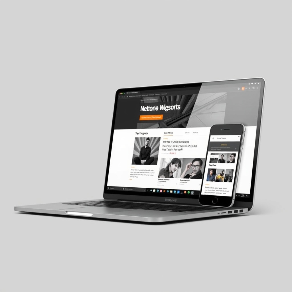
In today’s digital landscape, mobile responsiveness isn’t just a feature—it’s a necessity. We’ve all experienced the frustration of a website that doesn’t adapt to our device, and as designers, it’s our job to ensure seamless experiences across all screens. Responsive design principles guide us in creating layouts that fluidly adjust, ensuring content remains accessible and visually appealing.
Testing your design on multiple devices is crucial. What looks perfect on a desktop might break on a smartphone. Tools like Bennetts Design’s responsive testing can help identify issues early. Common pitfalls include oversized images and unreadable text, but with careful planning, these can be avoided. Remember, a mobile-friendly site isn’t just user-friendly—it’s also favoured by search engines.
Understanding Responsive Design Principles
Responsive design hinges on flexible grids, fluid images, and media queries. These elements work together to ensure your site adapts to any screen size. We prioritise content hierarchy, ensuring the most important information is always front and centre. This approach not only enhances usability but also aligns with modern web design standards.
Testing Your Design on Multiple Devices
Testing across devices reveals inconsistencies that might otherwise go unnoticed. From iPhones to tablets, each device has unique quirks. We use emulators and real devices to simulate user experiences, ensuring our designs are robust. This step is non-negotiable—after all, a broken layout can drive users away faster than slow loading times.
Common Pitfalls in Mobile Design and How to Avoid Them
Overloading mobile pages with heavy elements is a common mistake. Optimising images and leveraging lazy loading can mitigate this. Another pitfall is neglecting touch targets—buttons too small for fingers lead to frustration. By adhering to best practices, we create mobile experiences that are intuitive and enjoyable.
Rule 4 Fast Loading Times
Speed is a cornerstone of user satisfaction. Studies show that users abandon sites that take longer than three seconds to load. We optimise every element, from images to scripts, to ensure lightning-fast performance. A speedy site not only retains users but also boosts SEO rankings, making it a win-win for everyone.
Server response times play a pivotal role. Choosing a reliable hosting provider, like those recommended by Bennetts Design, can make all the difference. Tools like Google PageSpeed Insights help us measure and improve performance, ensuring our designs are as efficient as they are beautiful.
Optimising Images and Media for Speed
Large media files are often the culprits behind slow loading times. We compress images without sacrificing quality and use modern formats like WebP. Lazy loading ensures media only loads when needed, reducing initial load times. These techniques keep our sites snappy and user-friendly.
The Importance of Server Response Times
A slow server can undermine even the most optimised design. We partner with top-tier hosting providers to minimise delays. Regular performance audits help us identify bottlenecks, ensuring our sites remain fast and reliable. After all, a seamless user experience starts with a solid foundation.
Tools to Measure and Improve Website Speed
Tools like GTmetrix and Pingdom provide actionable insights into performance. We use these to fine-tune every aspect of our sites, from caching strategies to code minification. Continuous monitoring ensures our designs stay ahead of the curve, delivering speed without compromise.
Rule 5 Clear Call-to-Actions
CTAs are the gateways to conversions. A well-designed CTA guides users toward desired actions, whether it’s signing up or making a purchase. We focus on clarity and visibility, ensuring CTAs stand out without overwhelming the design. A/B testing helps us refine placements and messaging, maximising engagement.
Placement is key. CTAs should be strategically positioned where users naturally look, such as at the end of compelling content. Tools like Hotjar provide heatmaps to validate our choices. By combining data with design intuition, we create CTAs that drive results.
Designing Effective CTAs
Effective CTAs use contrasting colours and concise copy. We avoid generic phrases like “Click Here” in favour of action-oriented language. Testing variations helps us identify what resonates most with users, ensuring our CTAs are as persuasive as possible.
Placement and Visibility of CTAs
Above the fold isn’t always the best place for a CTA. Context matters—users need to understand the value before they act. We experiment with placements, using analytics to guide our decisions. The goal is to make CTAs feel natural, not intrusive.
A/B Testing for CTA Optimization
A/B testing removes guesswork from CTA design. We test everything from button colours to copy, using data to inform our choices. This iterative process ensures continuous improvement, turning good CTAs into great ones.

Leveraging Visual Hierarchy
Visual hierarchy guides users through your design, highlighting what matters most. We use size, colour, and contrast to create intuitive pathways. This approach ensures users absorb information in the intended order, enhancing both usability and aesthetics.
Typography plays a crucial role. Headlines should command attention, while body text remains readable. By mastering these principles, we create designs that are not only beautiful but also functional. For deeper insights, explore this external resource on visual hierarchy.
Principles of Visual Hierarchy in Web Design
Hierarchy starts with understanding user behaviour. We prioritise elements based on importance, using tools like Bennetts Design’s graphic design expertise to craft balanced layouts. Focal points draw attention, while secondary elements support the narrative. This structured approach ensures clarity and coherence.
Using Color and Contrast to Guide Users
Colour and contrast are powerful tools. Bold hues highlight key actions, while subtle tones provide context. We ensure sufficient contrast for readability, adhering to accessibility standards. This thoughtful use of colour enhances both aesthetics and usability.
Typography and Its Impact on Hierarchy
Typography shapes how users perceive content. We choose fonts that reflect brand personality while ensuring legibility. Hierarchy is reinforced through font weights and sizes, creating a seamless reading experience. Every typographic decision is intentional, supporting the overall design goals.
The Role of Colour Psychology
Choosing the Right Colour Palette
Selecting the right colour palette is more than just aesthetics; it’s about evoking the right emotions. I always start by understanding the brand’s identity and target audience. Warm colours like red and orange can energise, while cool tones like blue and green create calm. Tools like Adobe Colour help me experiment with harmonies. Consistency in colour usage builds trust and reinforces brand recognition.
Colour accessibility is equally important. I ensure sufficient contrast for readability and consider colour blindness. A well-chosen palette enhances user experience and guides attention. For example, a call-to-action button in a contrasting colour stands out. Testing colours across devices ensures they appear as intended. It’s a balance between creativity and functionality.
Emotional Responses to Colours
Colours evoke subconscious emotions, influencing user behaviour. Red can signal urgency or passion, often used for sales or alerts. Blue conveys trust and professionalism, ideal for corporate sites. Green is associated with nature and growth, perfect for eco-friendly brands. I analyse the psychological impact of each hue to align with the site’s goals.
Cultural differences also play a role. While white symbolises purity in some cultures, it represents mourning in others. I research the audience’s cultural background to avoid missteps. A/B testing helps gauge emotional responses. For instance, changing a button colour can significantly impact conversions. Understanding these nuances ensures the design resonates globally.
Colour Trends in Web Design
Staying updated with colour trends keeps designs fresh and relevant. In 2025, muted pastels and bold neons are gaining traction. I blend trends with timeless elements to avoid dated looks. Gradient backgrounds and duotones add depth without overwhelming users. Tools like web design trends provide insights into emerging palettes.
Sustainability is influencing colour choices, with earthy tones reflecting eco-conscious brands. Dark mode designs are also popular, reducing eye strain and saving energy. I experiment with trends but prioritise usability. For example, a trendy neon font might look stylish but could harm readability. Balancing innovation with practicality ensures a lasting impact.
Typography Matters
Selecting Readable and Web-Friendly Fonts
Typography is the backbone of readability and user experience. I opt for web-safe fonts like Arial or Georgia for consistency across devices. Google Fonts offers a vast library, but I limit choices to two or three to maintain cohesion. Sans-serif fonts work well for digital screens, while serifs add elegance for headings.
Load times are crucial. Custom fonts can slow down a site, so I use font-display: swap to ensure text remains visible during loading. Pairing fonts requires contrast—a bold headline with a clean body font creates hierarchy. Testing readability on mobile devices is non-negotiable. Tiny fonts frustrate users, while oversized ones disrupt flow.
The Balance Between Aesthetics and Functionality
Beautiful typography shouldn’t compromise functionality. I avoid overly decorative fonts for body text, as they hinder readability. Line spacing and letter kerning are adjusted for optimal legibility. A website design with balanced typography guides users effortlessly. Tools like Figma help visualise spacing before implementation.
Hierarchy is key. Headings, subheadings, and body text should be distinct yet harmonious. I use size, weight, and colour to differentiate levels. For example, a bold, large heading grabs attention, while lighter subheadings provide context. Consistency across pages ensures a seamless experience. Typography isn’t just about looks—it’s about communication.
Best Practices for Typography in Web Design
Responsive typography adapts to screen sizes. I use relative units like em or rem for scalability. Dark text on light backgrounds is standard, but dark mode requires adjustments. Accessibility guidelines recommend a minimum font size of 16px for body text. I test designs with tools like WebAIM to ensure compliance.
Micro-interactions, like hover effects on links, enhance engagement. Animated typography can add flair but mustn’t distract. I keep animations subtle and purposeful. For multilingual sites, I choose fonts that support special characters. Typography is a silent ambassador of the brand, and getting it right elevates the entire design.
Incorporating Multimedia Wisely
When to Use Images and Videos
Multimedia enriches storytelling but must serve a purpose. I use images to break up text and illustrate concepts. Videos are ideal for tutorials or testimonials, but autoplay is avoided to respect user preferences. High-quality visuals are non-negotiable—blurry images undermine credibility. Graphic design principles guide my choices.
Loading speed is a priority. I compress images without sacrificing quality and use lazy loading for videos. Background videos can be impactful but are reserved for key sections. Overuse of multimedia overwhelms users, so I strike a balance. Every element should enhance the message, not distract from it.
Optimising Multimedia for Performance
Performance optimisation is critical for user retention. I convert images to WebP format for faster loading. Video files are hosted on platforms like YouTube or Vimeo to reduce server strain. Thumbnails and captions improve accessibility and SEO. Tools like GTmetrix help identify bottlenecks.
Responsive design ensures multimedia adapts to all devices. I avoid large files that slow down mobile users. For example, a hero image is resized for smaller screens. Testing across browsers guarantees consistency. Multimedia should elevate the experience, not hinder it.
Accessibility Considerations for Multimedia
Accessibility is a cornerstone of inclusive design. I add alt text to images for screen readers and provide transcripts for videos. Closed captions are included for audio content. Autoplay is disabled to prevent sensory overload. Colour contrast in multimedia ensures readability for all users.
Interactive elements, like sliders, are keyboard-navigable. I avoid flashing content that could trigger seizures. Testing with assistive technologies ensures compliance. Multimedia should be enjoyable for everyone, regardless of ability.

SEO and Web Design
Designing with SEO in Mind
SEO begins with design. I structure content with header tags (H1, H2) for clarity and search engines. Internal linking, like SEO basics, improves navigation and ranking. Clean URLs and descriptive meta tags enhance discoverability. Mobile-first design is prioritised, as Google indexes mobile versions first.
Page speed is a ranking factor. I minimise code and leverage browser caching. Structured data markup helps search engines understand content. A sitemap ensures all pages are indexed. SEO-friendly design isn’t an afterthought—it’s integrated from the start.
The Impact of Site Structure on SEO
A logical site structure aids both users and search engines. I organise content hierarchically, with clear categories and subcategories. Breadcrumbs improve navigation and reduce bounce rates. Flat structures, where all pages are a few clicks away, enhance crawlability.
URLs are concise and keyword-rich. Duplicate content is avoided to prevent penalties. A well-structured site boosts rankings and user experience. For example, an e-commerce site benefits from filtered navigation. Every design decision considers SEO implications.
Mobile-First Indexing and Design Implications
Google’s mobile-first indexing means mobile design is paramount. I ensure responsive layouts adapt seamlessly. Touch-friendly buttons and readable fonts are essential. Accelerated Mobile Pages (AMP) can improve load times. Testing on multiple devices guarantees consistency.
Content parity between desktop and mobile is crucial. Hidden content on mobile harms rankings. I prioritise above-the-fold content for quick access. Mobile optimisation isn’t optional—it’s a necessity for visibility. For more insights, check this authoritative guide on mobile-first best practices.
Security Considerations in Design
Protecting User Data Through Design
We prioritise safeguarding user data by integrating security measures into our design process. This includes encrypting sensitive information and ensuring secure data transmission. By designing with privacy in mind, we build trust and comply with regulations like GDPR. Every element, from forms to payment gateways, must adhere to strict security protocols to prevent breaches and protect user confidentiality.
Avoiding common pitfalls, such as storing passwords in plain text, is crucial. We implement robust authentication methods and regular security audits to identify vulnerabilities. Our goal is to create a seamless yet secure experience, balancing functionality with protection. Users should feel confident their data is safe without compromising usability.
SSL Certificates and Their Role in User Trust
SSL certificates are non-negotiable for establishing trust. They encrypt data between the user’s browser and our server, ensuring sensitive information remains private. A padlock icon and “https” in the URL signal security, reassuring visitors. Without SSL, users may abandon your site, fearing data theft or phishing attacks.
We recommend purchasing certificates from reputable providers and keeping them updated. Regularly renewing SSL certificates prevents lapses in security. Additionally, educating users about the importance of SSL fosters transparency and reinforces trust. It’s a small investment with significant returns in credibility.
Common Security Flaws and How to Avoid Them
Many websites fall victim to outdated software or weak passwords. We mitigate these risks by staying current with updates and enforcing strong password policies. Cross-site scripting (XSS) and SQL injections are other threats we address through sanitised inputs and secure coding practices.
Regular penetration testing helps us identify and fix vulnerabilities before they’re exploited. By prioritising security in every design decision, we minimise risks and protect both our clients and their users. A proactive approach ensures long-term safety and reliability.
Testing and Iteration
The Importance of User Testing
User testing is the backbone of effective design. We observe real users interacting with our site to uncover pain points and opportunities for improvement. This feedback is invaluable for refining navigation, layout, and functionality. Without testing, assumptions can lead to costly redesigns and frustrated users.
We conduct both moderated and unmoderated tests to gather diverse insights. Tools like heatmaps and session recordings reveal how users engage with our content. By iterating based on real behaviour, we create intuitive, user-friendly experiences that resonate.
Gathering and Implementing Feedback
Feedback loops are essential for continuous improvement. We collect input from surveys, analytics, and direct user comments. This data guides our design adjustments, ensuring we meet evolving needs. Transparency about changes fosters a collaborative relationship with our audience.
Acting on feedback demonstrates our commitment to user satisfaction. Whether it’s simplifying a checkout process or enhancing accessibility, every tweak is informed by real-world use. This iterative approach keeps our designs relevant and effective.
Continuous Improvement in Web Design
Web design is never static; it evolves with technology and user expectations. We stay ahead by embracing new tools and trends while maintaining core principles. Regular audits and A/B testing help us measure performance and identify areas for enhancement.
Our philosophy is to learn, adapt, and innovate. By fostering a culture of continuous improvement, we ensure our designs remain cutting-edge and user-centric. The journey doesn’t end at launch—it’s an ongoing process of refinement.
Staying Ahead with Emerging Trends
Keeping Up with Web Design Innovations
The digital landscape is constantly shifting, and we make it our mission to stay informed. From AI-driven personalisation to voice search optimisation, we explore emerging technologies to enhance user experiences. Attending conferences and following industry leaders keeps us at the forefront of innovation.
Experimenting with new techniques, like dark mode or micro-interactions, allows us to push boundaries. However, we balance novelty with usability, ensuring trends serve a purpose rather than distract. Our goal is to integrate advancements that add value.
The Future of Web Design
We anticipate a future where immersive technologies like AR and VR redefine user engagement. Accessibility will also play a larger role, with designs catering to diverse needs. Sustainability in web design, such as reducing carbon footprints, is another growing focus.
Preparing for these shifts requires flexibility and foresight. By staying adaptable, we ensure our designs remain relevant and impactful. The future is exciting, and we’re ready to embrace it.
Resources for Continuous Learning
Learning never stops in web design. We rely on platforms like The SSL Store for security insights and industry blogs for trend updates. Online courses and communities also provide valuable knowledge-sharing opportunities.
Encouraging team members to pursue certifications and attend workshops fosters growth. Investing in education ensures we deliver the best possible solutions to our clients. The more we learn, the better we design.
Frequently Asked Questions
Why is SSL important for my website?
SSL encrypts data between your site and users, protecting sensitive information like passwords and payment details. It also boosts trust, as visitors see a padlock icon and “https” in the URL. Without SSL, users may perceive your site as unsafe, leading to higher bounce rates and lost conversions.
How often should I update my website’s design?
Regular updates keep your site fresh and functional. We recommend minor tweaks quarterly and major redesigns every 2-3 years. However, continuous testing and feedback may prompt more frequent adjustments. Staying current with trends and user expectations ensures your site remains effective.
What are the biggest security risks for websites?
Common risks include outdated software, weak passwords, and unsecured forms. Cross-site scripting (XSS) and SQL injections are also threats. Regular updates, strong authentication, and secure coding practices mitigate these risks. Proactive measures like penetration testing help identify vulnerabilities before they’re exploited.
How can I improve my website’s loading speed?
Optimise images, leverage browser caching, and minimise HTTP requests. Choose a reliable hosting provider and use a content delivery network (CDN). Regularly audit your site with tools like Google PageSpeed Insights to identify and fix performance bottlenecks. Faster loading times enhance user experience and SEO rankings.
