
Web design plays a crucial role in creating engaging and functional websites. Whether you’re building your first site or trying to improve an existing one, understanding the basics is key. Web design is not just about making things look pretty; it is about ensuring the site is usable and effective. This involves a combination of layout, colours, fonts, and images that work together to create a seamless user experience.

Sign up now
No hassle, no spam—just a newsletter covering all things tech!
I have explored various tools and techniques that make web design more efficient and impactful. By focusing on both user experience (UX) and user interface (UI), I can create sites that are not only visually appealing but easy to navigate. There is a variety of resources available that can guide you in web design, from tutorials to professional advice found on platforms like the Web Design Library.
As technology evolves, new trends in web design continue to emerge. Staying up to date with these changes allows me to craft websites that are not just modern but also forward-thinking. Whether you are interested in the basics or looking to implement advanced features, web design offers endless possibilities to explore and innovate.
Key Takeaways
- Web design enhances site functionality and appearance.
- User-focused design is essential in creating effective websites.
- Keeping up with trends aids in modern, adaptable site creation.
Foundations of Web Design
In this section, I explore the essential components of web design: HTML, CSS, and web development concepts. Each part plays a crucial role in building functional and visually appealing websites.
HTML Basics
HTML, or Hypertext Markup Language, acts as the backbone of website design. It structures the content on webpages using elements like headings, paragraphs, lists, and links. For any web developer, mastering HTML is fundamental.
Elements: HTML uses tags with angle brackets, such as <h1> for headings and <p> for paragraphs. These elements define how content appears in a browser.
Attributes: Attributes provide additional information about elements. For example, the href attribute in an <a> tag specifies the URL for a hyperlink.
Learning HTML basics enables you to create a solid framework for a webpage. For detailed guidance, beginners might find resources like Foundations of Web Design – HTML and CSS basics especially useful.
CSS Essentials
CSS, or Cascading Style Sheets, brings style and layout to webpages. It controls the visual presentation, like colours, fonts, and spacing.
Selectors: Selectors target HTML elements to apply styles. For instance, the selector h1 changes the style of all <h1> elements on a page.
Properties and Values: CSS uses properties like colour or font-size, paired with specific values, to specify styles. For example, colour: blue; sets text colour to blue.
Layout Techniques: Modern CSS includes layout techniques like Flexbox and Grid, which allow for complex designs. These tools are crucial for responsive design, ensuring websites adapt to different screen sizes.
Aspiring web developers keen on mastering styling should explore resources like this CSS tutorial.
Understanding Web Development
Web development involves both front-end and back-end tasks, requiring developers to integrate various technologies. Front-end focuses on user experience, using HTML, CSS, and JavaScript.
Front-end Development: This involves creating interactive elements and ensuring a smooth user interface. Familiarity with JavaScript enhances interactivity on webpages.
Back-end Development: This handles server-side logic, databases, and application performance. Web developers often use languages like Python or JavaScript (Node.js) for backend processes.
Web development requires a mix of technical skills and creativity to build effective websites. Committing to continuous learning helps stay updated with evolving tools and techniques. For a more in-depth exploration, How to learn web design in 9 steps might offer valuable insights.
Design Elements and Principles
When designing a website, I pay close attention to typography, colour, and layout. Each element works together to create a cohesive and engaging user experience that reflects the brand’s identity and goals.
Typography and Styles
Typography is key in web design. I focus on choosing fonts that are easy to read and match the brand’s identity. Fonts should have the right size and spacing to ensure clarity across different devices. Pairing fonts can add visual interest; a common practice is using a bold font for headings and a simpler one for body text. Emphasising readability is crucial, so I always test how the text looks in different contexts. Using styles like italics or bold can highlight important parts and guide the flow of the content.
Colour Theory and Imagery
Colour impacts how users perceive a brand. I select colours that align with the brand’s identity and appeal to the target audience. This can include a mix of primary and secondary colours for diversity. Contrast should be considered to make text more readable against backgrounds. Imagery also plays a key role by enhancing the visual appeal. I choose images that resonate with the brand and are of high quality. Together, these elements work to create a vibrant and welcoming interface, which is a staple in effective web design.
Layout and Composition
Creating an effective layout requires careful thought. I usually start by sketching a wireframe to plan the basic structure of components. A balanced composition helps users navigate content easily. I aim for a mix of white space and content to prevent clutter. This approach ensures that users can focus on the main call-to-action elements. Responsive design is essential, so I implement flexible grids and layouts that adjust to different screen sizes. This ensures a seamless experience, whether users are on a desktop or mobile device.
User Experience (UX) and User Interface (UI)
When discussing web design, the terms user experience (UX) and user interface (UI) are crucial. They must work together to ensure a website is both visually appealing and easy to use.
Principles of User Experience
User experience focuses on how users feel when interacting with a product. It involves understanding user needs and designing products that are useful and enjoyable. As a UX designer, my goal is to create seamless experiences by conducting thorough user research. This often includes methods like surveys and interviews to gather insights into what users need and expect from a website.
Understanding usability is vital. It is essential to create intuitive navigation and ensure content is accessible to everyone. Accessibility is part of this, making sure that all users, including those with disabilities, find the website easy to use. Simplicity is key in this process, allowing users to achieve their goals with minimal effort.
Crafting Effective User Interfaces
The user interface (UI) is about designing the look and feel of a website. I focus on creating visual harmony through colour schemes, fonts, and layouts. This involves crafting an aesthetically pleasing environment where every element is consistent and serves a purpose.
UI is not just about appearance. It involves creating responsive designs that adapt to different devices and screen sizes. By incorporating clear, engaging call-to-action buttons, I ensure users can easily interact with the site. Every visual element should enhance the user journey and facilitate interactions.
Interactivity and Prototyping
Interactivity lies at the intersection of UX and UI. It’s about making a website engaging and responsive through interactive elements like buttons, menus, and animations. These features should enhance usability without distracting from the content.
Prototyping is a vital step in the design process. By creating prototypes, I can test ideas quickly and efficiently. This allows me to explore different design options and gather feedback from users before finalising a design. Prototyping tools are essential for visualising and refining the interactive aspects of a website. Through this iterative process, the final product is both functional and appealing.
Responsive and Adaptive Design
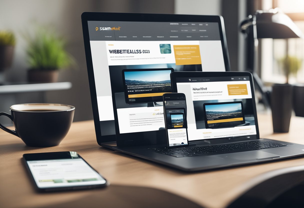
Exploring responsive and adaptive design helps in creating web pages that look good on any device. I will be discussing components like media queries, mobile-first approaches, and testing techniques to optimise designs.
Media Queries and Breakpoints
Media queries are essential tools in responsive design, allowing developers to adjust layouts based on device characteristics. These CSS features enable me to set breakpoints, which are specific points where the design adapts to different screen sizes. By using breakpoints, the layout can shift and arrange itself seamlessly on devices ranging from smartphones to desktops.
I often use frameworks like Bootstrap to simplify this process. Bootstrap comes with built-in media queries, which take the guesswork out of responsive design. It ensures that my web pages maintain usability and aesthetics across various viewports, making navigation and content accessible to everyone.
Mobile-First Design Philosophy
The mobile-first design philosophy starts with designing for smaller screens and then scaling up for larger ones. By prioritising mobile devices, I ensure that the most important content is displayed optimally. This approach often leads to simpler, faster webpages, benefiting users who might be browsing on less powerful devices.
Using a mobile-first strategy forces me to focus on essential elements, like navigation and content hierarchy. I add features and details as the screen size increases. This technique ensures that my designs remain functional and well-structured, regardless of the device.
Testing and Optimisation
Testing and optimisation are crucial for both adaptive and responsive web designs. I employ various tools and techniques to examine how designs perform on different devices and browsers. Real-time testing on actual devices can reveal issues that emulators might miss.
Tools like Google Lighthouse help me assess page speed and performance, offering suggestions for improvements. Regular testing ensures that UI elements like navigation work as intended, and prototypes are vital for gathering feedback during early stages. With constant optimisation, my designs are both efficient and user-friendly, providing a smooth experience across all platforms.
Web Design Tools and Resources
Exploring the right tools and resources is key for anyone interested in web design. From powerful design software to dynamic online galleries and user-friendly content management systems, the right assets can make a significant difference in productivity and creativity.
Design Software and Applications
Choosing the right design software is crucial for any web designer. One of my favourites is Figma, a robust platform allowing real-time collaboration among designers.
Other notable tools include Adobe XD, known for its vector-based capabilities and prototyping features. Similarly, Desygner offers a user-friendly interface for creating web graphics, logos, and more. With these tools, you can craft designs that are both aesthetic and functional.
Online Resources and Galleries
Online resources provide abundant inspiration and ideas for web designers. Websites like Awwwards showcase the best in innovative web design, offering a plethora of creative ideas. Another valuable platform is Behance, where designers share their portfolios and get feedback.
I often browse these sites to keep up with current trends and to gather inspiration for my own projects. These galleries not only serve as a showcase but also as a learning platform for understanding modern design aesthetics.
Content Management Systems
Content Management Systems (CMS) are vital for building and maintaining websites without needing in-depth coding skills. WordPress is a popular CMS that offers a wide array of themes tailored to different purposes.
With its extensive library of plugins and themes, WordPress allows me to create customisable websites with ease. Other CMS options like Wix provide similar functionality with user-friendly, drag-and-drop interfaces, catering to both beginners and advanced users.
These systems streamline the web design process, making it accessible to a broader audience.
Optimisation Techniques
I want to share some valuable insights on essential optimisation techniques that can significantly enhance web design. These techniques focus on improving visibility, performance, and accessibility to create a well-rounded and effective website.
Search Engine Optimisation (SEO)
In my experience, SEO is crucial for increasing a website’s visibility on search engines. It involves using relevant keywords to improve search rankings. Using tools like Yoast can simplify this process. They help in structuring web pages efficiently, making them more appealing to search engines.
Another important aspect is conducting detailed keyword research. Keywords must align with user intent and enhance the site’s relevance. It’s essential to keep the content updated and consistent to maintain high rankings. This is part of my digital marketing strategy when optimising a website.
Performance and Speed
Performance and speed are vital for retaining visitors. Users expect websites to load quickly, and delays can result in lost traffic. I focus on optimising images, using compression tools to reduce file sizes, and choosing reliable hosting providers. These steps help in improving load times.
Using caches can also boost performance. It stores frequently accessed data and reduces server load. Another effective technique is minimising code, which improves speed by reducing the amount of data transferred between the server and the user’s browser.
Accessibility Standards
Adhering to accessibility standards is an essential part of web design. This ensures that websites are usable by everyone, including people with disabilities. I prioritise using semantic HTML, which makes it easier for assistive technologies to interpret content.
Alt texts for images are another crucial element. They provide descriptions for visually impaired users. Moreover, ensuring proper contrast in colours helps those with visual impairments navigate the site better. Implementing these accessibility standards ensures a website reaches a wider audience and adheres to best practices.
Ecommerce and Business Web Design
When designing ecommerce and business websites, it’s crucial to focus on user experience, conversion goals, and strong branding elements. These components ensure that the site not only attracts visitors but also encourages them to engage and make purchases.
Designing for Ecommerce
Creating an effective ecommerce site starts with understanding the audience. I focus on intuitive navigation, ensuring users can easily find products through both categories and search. Features like filters and sorting options help refine results, giving users the control they need to find what they want quickly.
Security is another key concern. Users need assurance that their personal and payment information is safe. Implementing robust security measures and clearly displaying trust badges can build this confidence. Trust is also fostered through customer reviews and ratings.
Responsive design is essential, as many users shop on mobile devices. By ensuring the site is easily accessible and usable on various screen sizes, I enhance the user experience. For tips on creating a user-friendly ecommerce website, check out these examples and tips.
Conversion-Focused Design
The primary goal of any ecommerce site is conversion. This means turning visitors into paying customers. A well-designed conversion funnel guides users seamlessly from landing pages to checkout with minimal distractions.
Clear calls to action (CTAs) are crucial. I make sure CTAs are prominent and persuasive, encouraging users to take desired actions, such as adding items to a cart or signing up for newsletters. A streamlined checkout process also enhances conversion rates, as complicated or lengthy steps can lead to cart abandonment.
Additionally, optimising website speed is essential. Slow-loading pages can deter potential customers, so I strive for fast load times through image optimisation and efficient coding.
Branding and Visual Identity
Strong branding and visual identity are vital for distinguishing an ecommerce site from its competitors. A cohesive design that reflects the brand’s values and message can significantly impact user perception and retention.
This involves consistent use of colours, fonts, and imagery that align with the brand. I also focus on crafting an engaging logo and memorable tagline, ensuring that they are prominently displayed across the site.
A visually appealing design captures attention and creates a memorable impression. By integrating these elements, I help create a strong brand identity and build trust with the audience. This guide on creating a brand identity offers more insights into effective ecommerce branding strategies.
Emerging Trends and Technologies

Staying current with web design trends is essential. Today, there are exciting new approaches to creating engaging, user-friendly designs. AI and generative design are revolutionising the field, offering novel ways to enhance user interaction through more dynamic interfaces.
Latest Web Design Trends
In 2024, one of the most prominent trends is the use of denser and richer graphics. This trend aims to create visually compelling websites that captivate users at first glance. Higher-quality images and videos are becoming norms, making websites more immersive.
Another significant trend is AI-generated designs. AI is now capable of assisting with layout and content, helping designers produce unique, data-driven results that enhance user experience. The rise of skeuomorphism is also noteworthy. With this trend, digital elements resemble their real-world counterparts to create familiarity and comfort.
Innovative Design Approaches
One approach reshaping web design is the use of parallax scrolling. This technique adds depth and engagement to websites by allowing background images to move slower than foreground images. This approach enhances user interaction and keeps visitors’ attention focused on the content.
I also see an increasing integration of UI frameworks to streamline design processes and improve functionality. Frameworks like Material Design and libraries like Anime.js are giving designers tools to create responsive, animated interfaces that offer seamless experiences. Moreover, CSS animations are being used more extensively to make interactions feel smoother and more engaging.
Future of Web Design
As I look to the future, the potential for web design is vast and exciting. Emerging technologies like augmented reality (AR) and virtual reality (VR) are paving the way for highly interactive and immersive web experiences. These technologies are set to transform how users interact with websites.
The incorporation of Internet of Things (IoT) will potentially allow websites to communicate with everyday devices, offering tailored experiences based on real-time data. This evolution will demand web designs that are not only visually appealing but also valuable and functional across numerous platforms.
Frequently Asked Questions
I will cover essential skills needed for web designers, as well as tools and templates helpful for commercial use. You will also find advice on choosing courses for beginners and recommendations for reputable web design companies.
A web designer needs a mix of creative and technical skills. Knowledge of HTML and CSS is fundamental. Skills in graphic design and proficiency in software like Adobe Creative Suite can enhance a designer’s work. Understanding user experience (UX) is also crucial for creating effective and engaging sites.
To improve proficiency, practising regularly is key. I recommend creating mock projects to test out new ideas and skills. Online courses and tutorials can provide structure and guidance. Engaging with web design communities and forums can also offer feedback and support.
Several software tools dominate the field. Adobe XD and Sketch are popular for designing user interfaces. Figma is gaining traction due to its collaborative features. Dreamweaver and WordPress are widely used for building and managing websites. Each has unique features that cater to different design needs.
For beginners, online platforms like Coursera and Udemy offer comprehensive courses. I find that they cover basics like HTML, CSS, and JavaScript, alongside design principles. Wix also offers guides for intuitive web-building without prior experience.
Templates from platforms like WordPress and Wix can jumpstart your project. They offer a wide range of customisable options suited for various industries. Commercial templates often include pre-designed modules that you can adapt to fit specific brand requirements. They balance aesthetics and functionality well.
Choosing a web design company involves looking at their portfolio and client testimonials. I recommend evaluating their past projects to gauge their style and expertise. It’s also essential to ensure they understand your business goals and have experience within your industry. Communication and clarity on pricing can help avoid misunderstandings.
