

Creating a website that stands out involves more than just attractive visuals; it combines several key design elements. A cool website design grabs attention quickly, ensuring that visitors are intrigued enough to explore further. By paying attention to both aesthetics and functionality, a site can leave a lasting impression.
- Key Takeaways
- The Importance of First Impressions
- Essentials of User Experience
- Branding and Identity
- Colour and Imagery
- Interactivity and Animation
- Content Strategy
- Optimising for Search Engines
- Technical Aspects of Web Design
- Website Design Inspiration
- Building Your Own Cool Website
- Frequently Asked Questions
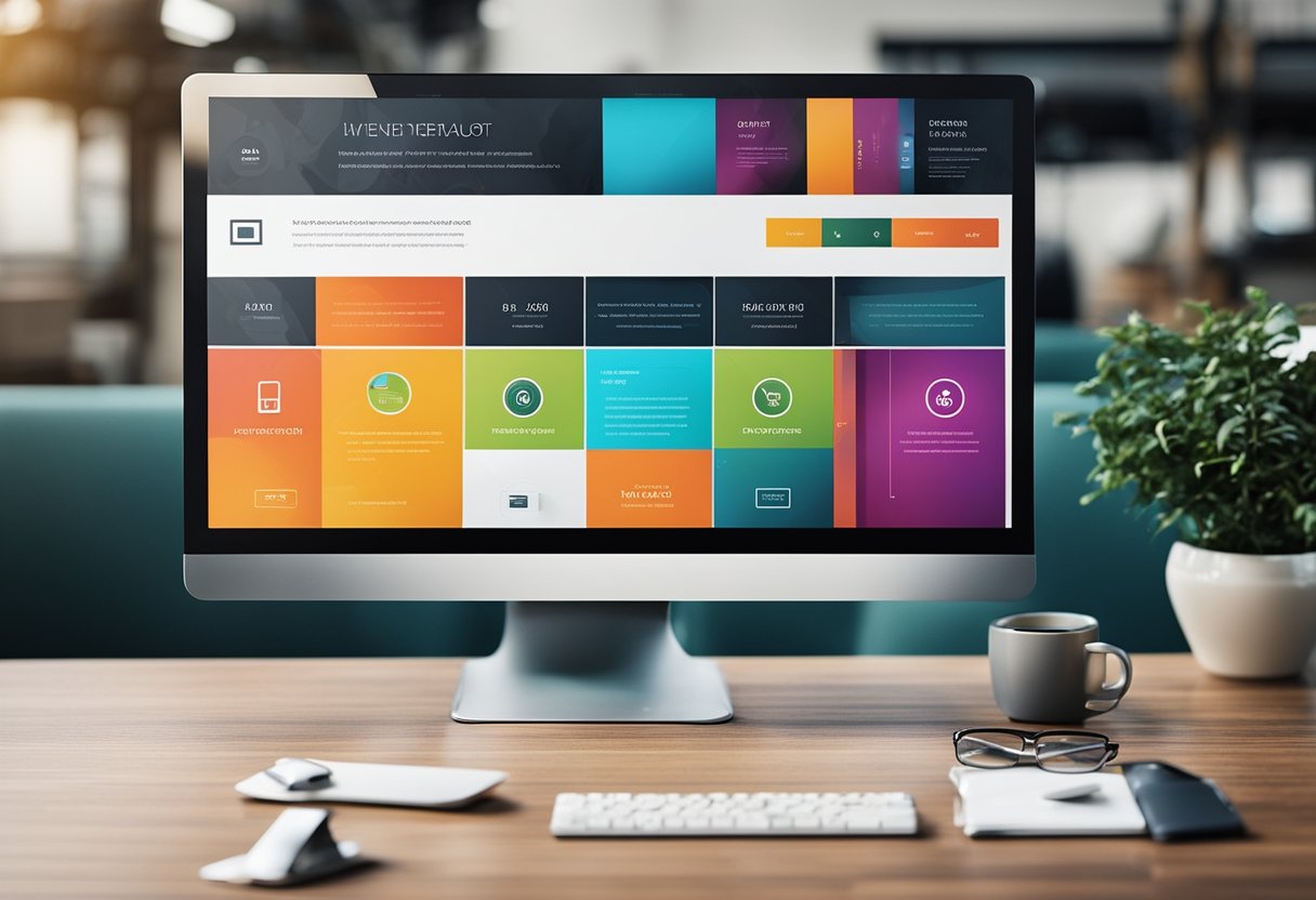
A cool website must balance user experience with branding to create a cohesive visual identity. This involves the intelligent use of colour schemes, impactful imagery, and intuitive navigation. Interactivity and animation add an element of surprise and delight, encouraging visitors to engage more deeply with the content.
In my approach to web design, every element has a purpose, from the layout to the technical underpinnings that ensure smooth operation across all devices. A good content strategy is essential, alongside optimisation for search engines to make sure the site not only looks good but also performs well in search rankings.

Sign up now
No hassle, no spam—just a newsletter covering all things tech!
Key Takeaways
- First impressions in web design are crucial.
- Balancing user experience with branding is key.
- A good design includes optimised technical elements.
The Importance of First Impressions
When someone visits a website, the first few seconds are crucial. These moments decide whether they will stay or leave. First impressions matter because they affect engagement, interest, and the site’s credibility.
Understanding Visual Hierarchy
In website design, visual hierarchy plays a key role in guiding the user through the content. I always focus on organising elements by their importance. This ensures visitors see the most critical parts first. Headings, images, and calls-to-action should stand out. Size, colour, and placement impact how these elements are perceived. For instance, larger and bolder fonts can highlight a headline, making it more noticeable than smaller text.
Using contrasting colours effectively can draw attention to specific parts of the page. Additionally, positioning key elements at the top of the page or near the centre ensures they get noticed quickly. By designing with these principles, a website can improve user interface and engagement without leaving visitors confused about where to focus their attention.
The Role of Aesthetics
The overall look and feel of a website greatly shape user perceptions. Aesthetics are not just about beauty; they contribute to a sense of reliability and professionalism. A visually appealing site uses clean lines, harmonious colours, and intuitive navigation. These design elements create an environment that attracts and retains users.
Additionally, consistent branding elements like logos and colour schemes build familiarity and trust. Selecting appropriate typography also contributes to readability and the message conveyed. I find that when visitors see a well-balanced design, they’re more likely to explore further. A cool website design seamlessly blends creativity with functionality, making the aesthetic appeal not just a choice but a necessity for effective web presence.
Essentials of User Experience

In crafting a cool website design, creating a seamless user experience is key. It’s about making navigation intuitive, ensuring typography enhances readability, and keeping the design mobile-friendly. These elements combine to create an engaging and accessible website.
Navigating the Site
A well-structured navigation menu is crucial for guiding users through a website. I focus on ensuring that menus are simple and intuitive, making it easy for visitors to find what they need quickly. Key features include a clear and consistent layout, logical categorisation, and a search function.
Drop-down menus can be effective but should not overwhelm. Vital information shouldn’t be buried under multiple layers. Instead, I design with the user’s journey in mind, prioritising easy access to popular or essential sections.
Proper navigation enhances the user experience by reducing frustration and improving time on site. It’s important to focus on user testing to identify pain points and make necessary adjustments.
Enhancing Readability with Typography
Typography plays an important role in user experience by affecting readability. I choose fonts that are not only stylish but also legible. Pairing different fonts can add visual interest, but they must complement each other.
I ensure that text size is appropriate for different devices, making content easy to read without excessive scrolling. Line spacing and paragraph structure also contribute to this, as text needs to be visually inviting.
Highlighting key information through bold or italicised text is another technique I use, drawing attention without detracting from overall readability. Proper contrast between text and background ensures accessibility for all users, including those with visual impairments.
Mobile-Friendly and Responsive Design
With more users accessing websites on mobile devices, mobile-friendly and responsive design is essential. I optimise sites to work on various screen sizes, from smartphones to tablets. This involves adaptable layouts that adjust seamlessly to different devices.
Ensuring fast loading times on mobile is a priority, as users expect quick access to information. Images and graphics need to be properly scaled, and touch-friendly navigation is included for ease of use.
Responsive design also involves testing across different devices and browsers. This ensures that the user experience remains consistent and enjoyable regardless of how a site is accessed.
Branding and Identity
In web design, branding and identity are essential to connecting with an audience. A well-designed site reflects a brand’s unique identity, ensuring consistent visuals and messages.
Consistency in Design
Consistency is key in crafting a strong brand identity. Elements like logos, colour schemes, and typography should be uniform across all pages. This creates a seamless experience, reinforcing the brand’s message and making it easily recognisable.
A detailed style guide can help maintain this uniformity by specifying how branding elements should be used. It ensures that any future content or updates remain aligned with original brand principles. This not only enhances memorability but also builds trust with visitors.
I focus on making sure every element feels like part of a cohesive whole. The visual language should be steady, allowing users to relate quickly to the website’s purpose and values.
Integrating Brand Identity
Integrating brand identity into a website goes beyond visuals; it involves conveying the brand’s personality and values. Logos play a central role, often being the first thing users notice. They should be displayed prominently and uniquely, resonating with the brand’s core message.
Every part of the website, from navigation to footer, should reflect the brand’s ethos. This includes the tone used in copywriting and interactive elements. By aligning the website design with brand identity, visitors gain a clear sense of who the brand is.
When designing, I consider aspects like brand story and mission to create an authentic experience. The goal is to present a site that not only looks appealing but truly represents the brand’s mission and story, helping to foster a deeper connection with our audience.
Colour and Imagery
Colour and imagery in website design affect how visitors perceive a brand. Selecting the right colour scheme and using high-quality visuals like photography and multimedia can enhance a site’s appeal and function.
Choosing a Colour Scheme
When picking a colour scheme, I focus on purpose and emotion. Whether it’s warmth, trust, or energy, each hue communicates something unique. It’s crucial to balance colours with brand objectives, ensuring consistency across all elements. For inspiration, I look at examples like the best website colour schemes that successfully convey brand identity while being visually appealing.
With colour theory in mind, I select colours that suit the website’s message and audience. Understanding how different colours can evoke emotions helps to craft a more engaging user experience. For accessibility, contrasting colours improve readability, making content easy to navigate for all users.
Incorporating Photography and Multimedia
I believe that quality visuals like photographs and multimedia elements enhance user engagement. Images must be relevant and of high resolution, supporting the site’s content and goals. Photographs should align with the brand’s tone, shaping the narrative conveyed to visitors. Meanwhile, different forms of multimedia, such as videos and animations, can add interactivity and depth.
In choosing visuals, authenticity matters. I avoid generic stock images and instead opt for photos that resonate with the brand’s values. A mix of various media types can cater to different user preferences, ensuring a richer experience. This approach not only captures visitor attention but also enhances the overall aesthetic and function of the site.
Interactivity and Animation
Incorporating animation into a website design enhances user interaction and engagement. Animations can transform static elements into dynamic experiences, boosting aesthetic appeal and maintaining user interest.
Employing Engaging Animations
When I add animations to a website, I focus on enhancing the user interface by making it more interactive. Techniques like CSS transitions and SVG animations can bring static designs to life. Motion graphics also play a key role, making navigation intuitive and responsive.
Animations aren’t just for decoration. They help in storytelling by guiding users through content naturally. For instance, animations can emphasise key points or illustrate complex ideas clearly. They help users understand information without overwhelming them.
I also consider the technical side. Animations should be lightweight to ensure quick loading times, which is vital for a seamless user experience. For inspiration, websites often use dynamic hero sections and interactive elements to make a lasting impression.
Content Strategy
Creating a strong content strategy involves developing relevant content that engages the audience and crafting clear calls-to-action (CTAs) that guide the user’s journey on the website. I’ll delve into the essentials of each aspect.
Developing Relevant Content
Developing relevant content starts with knowing your audience. I focus on their interests, needs, and the problems they face. By aligning my content with these factors, I ensure it resonates with the right audience. Storytelling plays an important role here. It makes the content engaging and relatable, which can increase retention and engagement. Using data-driven insights helps me tailor the content to match audience preferences more precisely.
Keeping content up-to-date is also a priority. This means regularly reviewing and updating it to reflect current trends and information. I use a mix of formats like articles, videos, and infographics to cater to different learning styles. This variety helps capture a wider audience.
Crafting Clear CTAs
Crafting clear CTAs is essential to guide visitors towards desired actions, whether it’s signing up for a newsletter, making a purchase, or downloading a resource. CTAs should be noticeable and use action-oriented language to encourage users to act. I often place them strategically within the content to ensure visibility without being intrusive.
Button design and placement are critical. I choose contrasting colours and legible fonts to make CTAs stand out against the page background. Positioning them near engaging content can improve their effectiveness. Testing different CTA variations helps me understand what works best.
Simplicity is key. I avoid cluttering the page with too many CTAs, which can overwhelm users. Instead, I prioritise the most important actions to keep it straightforward and effective.
Optimising for Search Engines
Effectively optimising your website for search engines involves selecting the right keywords and following SEO best practices. This ensures your site ranks well on search results and attracts the right audience.
Keyword Research and SEO Best Practices
I start by conducting thorough keyword research, which is crucial for successful SEO. This involves identifying the search terms that my target audience uses most frequently. Tools like Google Keyword Planner help find these keywords, enabling me to tailor my content to what people are searching for. By integrating these keywords naturally into my website’s content, I can improve its visibility.
In addition to keyword research, following SEO best practices is important. This includes creating quality content that is engaging and informative. I ensure that my website’s design is user-friendly and mobile-responsive, as this impacts search rankings. Page speed is also critical; a slow-loading site can hurt my rankings and drive visitors away. By focusing on these elements, I can help my website perform better in search engine results.
Technical Aspects of Web Design
When designing a website, several technical aspects ensure that it runs smoothly and meets user expectations. Important elements include optimising site speed, making sure the site is accessible to all users, and protecting the site from security threats.
Understanding Site Speed
Site speed is crucial for user experience and search engine rankings. If a site loads slowly, visitors might leave before viewing the content. I use tools like PageSpeed Insights to measure and improve loading times. A major part involves optimising images and reducing server response times. Efficient coding practices and minimising resource usage help in enhancing performance. It’s also important to ensure a mobile-friendly design since a significant portion of users access websites from mobile devices.
Ensuring Web Accessibility
Web accessibility ensures that a site can be used by people with disabilities. I focus on providing alternative text for images and ensuring proper use of headings. Implementing features like keyboard navigation and text-to-speech support is crucial. Compliance with standards such as the Web Content Accessibility Guidelines (WCAG) helps in achieving this. Accessible sites improve user experience for everyone and can enhance user interaction.
Site Security Considerations
Site security involves protecting a website from threats like hacking and data breaches. I prioritise using SSL certificates, which encrypt data between users and servers, making the site more trustworthy. Regularly updating software and plugins prevents vulnerabilities. Using strong passwords and two-factor authentication further protect user data. Security measures help maintain the integrity and reliability of a website. Taking these steps not only safeguards information but also builds user trust.
Website Design Inspiration

Finding the right inspiration for website design involves exploring various resources and examples. I aim to highlight key places where you can find creative ideas to enhance your web projects.
Exploring Design Inspiration Resources
When searching for design inspiration, I often look to curated galleries and innovative platforms. Websites like Best Website Gallery offer a highly curated selection of designs, allowing me to explore based on colour, CMS, and style. This is helpful in finding unique and trendy ideas.
Website design examples available on platforms such as Wix showcase innovative uses of technology and design. Their drag-and-drop features are perfect for creating visually stunning sites, offering a plethora of templates created by top designers.
For those using WordPress, there are countless themes and plugins available to enhance a site’s appeal. These resources provide flexibility and customisation options, empowering me to create truly cool websites tailored to my taste. With such a variety of tools and examples, finding inspiration becomes a seamless and enjoyable process.
Building Your Own Cool Website
Creating your own website involves understanding its purpose and what design aspects will make it effective. Whether building an ecommerce site or hiring a designer, making informed choices ensures your website stands out.
Types of Websites and Their Purposes
When you think about building a website, the first step is to identify the type and purpose. Websites can be personal blogs, portfolios, business sites, or ecommerce platforms. Each serves a different goal.
For a business, a well-designed ecommerce website can increase sales by offering a seamless shopping experience. A professional website often showcases services and helps in attracting clients. For creative professionals, a portfolio website highlights their work. Each site type should focus on user experience. This involves easy navigation, fast loading times, and mobile responsiveness. A good website design maximises functionality while reflecting a brand’s identity.
Hiring a Professional Designer
Deciding to hire a designer can elevate your website beyond basic templates. Professional designers bring expertise in aesthetics and user experience. They understand how to structure a site for clarity and appeal. When I hire a designer, I gain access to skills that help create a unique professional website.
Designers work on aspects like layout, colour schemes, and overall functionality. I value their ability to incorporate branding elements seamlessly. Hiring a designer often involves sharing your vision and goals. This collaboration helps ensure that the final product aligns with my expectations and meets the needs of my audience.
Frequently Asked Questions
When it comes to creating a cool website design, several elements play a crucial role. Effective design can improve user engagement and even influence a website’s marketing success. Let’s explore these aspects further.
A compelling website design includes clear navigation, attractive visuals, and consistent branding. These elements help create a user-friendly experience.
To know if a design is effective, I look at metrics like user engagement, bounce rates, and conversion rates. These data points indicate how well the design meets its objectives.
For a visually appealing website, I focus on using a harmonious colour scheme, readable fonts, and high-quality images. Balancing these elements is key.
Engaging content, quick loading times, and interactive features can hold users’ attention. It’s also important to make sure the site is mobile-friendly.
I keep principles like balance, contrast, and alignment in mind to ensure a cohesive look. This helps form a smooth and aesthetically pleasing user experience.
A well-designed website builds trust and authority, which can enhance marketing efforts. An intuitive layout and strong call-to-action prompts can lead to higher conversions.
